OVERVIEW
COMPANY
Haicheng JiaZhi
Textile & Apparel
YEAR
2025
ROLE
Product Design
User Experience
Brand Identity
TOOL
Figma
Adobe Illustrator
Adobe Photoshop
Adobe InDesign
Shopify
Cryven is a contemporary menswear label designed around the concept of multi-scene versatility — garments that transition seamlessly between work, travel, and everyday life. The project focused on building a cohesive brand foundation capable of supporting product launches, marketing campaigns, and e-commerce growth.
The goal was to transform an undefined visual direction into a structured and scalable identity system that could operate consistently across packaging, digital platforms, and physical touchpoints.
THE CHALLENGE
Before this project, Cryven lacked a unified brand system. There was no clearly defined visual language, tone of voice, or structured application across marketing and product materials. As a result, the brand risked appearing inconsistent and fragmented during its launch phase.
The challenge was to create a cohesive identity that balanced minimal modern aesthetics with functional clarity — ensuring the brand could scale across packaging, Shopify storefront design, promotional content, and future campaigns without losing recognition or coherence.


MY ROLE
As a Brand Design / Product Design intern, I contributed to the development and execution of Cryven’s visual identity under the guidance of my supervisor. My responsibilities included logo design refinement, visual system development, packaging design, poster layouts, label tags, and social media assets.
As a Brand Design / Product Design intern, I contributed to the development and execution of Cryven’s visual identity under the guidance of my supervisor. My responsibilities included logo design refinement, visual system development, packaging design, poster layouts, label tags, and social media assets.
DESIGN SYSTEM
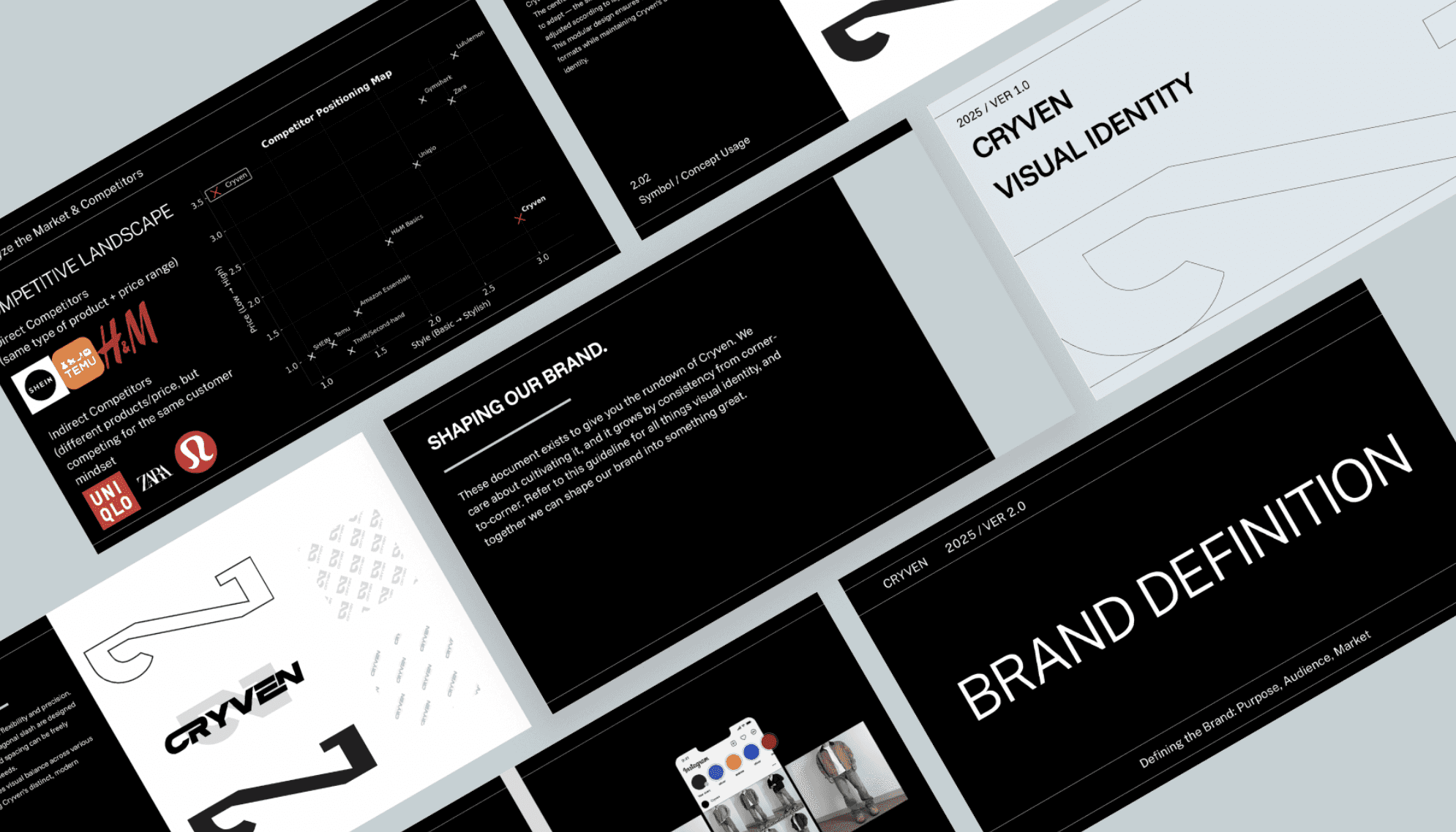
A significant portion of the work involved defining Cryven’s core brand system. This included establishing the primary and secondary color palette, typographic hierarchy, spacing logic, and supporting graphic elements that formed the brand’s visual rhythm.
I designed key physical and digital assets — including packaging, promotional posters, label systems, and social templates — ensuring that each application followed a consistent structural framework. The system was built to maintain clarity, recognizability, and adaptability across different mediums and future product releases.


VARIANTS & GUIDELINES
To ensure scalable implementation, I developed structured usage guidelines and variant systems for key brand components. This included defining logo clear space rules, monochrome and alternate logo treatments, typography hierarchy standards, and layout grid recommendations.
I designed key physical and digital assets — including packaging, promotional posters, label systems, and social templates — ensuring that each application followed a consistent structural framework. The system was built to maintain clarity, recognizability, and adaptability across different mediums and future product releases.


MAIN TAKEAWAYS
This project strengthened my understanding of brand system thinking beyond surface-level aesthetics. I learned how to construct a scalable identity framework that operates consistently across physical products, marketing materials, and digital environments.
Cryven reinforced my ability to translate conceptual brand positioning into structured visual systems — balancing creative expression with long-term functional clarity.